Investment · Axis Bank
Nivesh — A Mutual Fund Experience
An end-to-end redesign, from discovery to portfolio, built so two very different investors each invest with confidence.
~10% more registrations, on a journey moving thousands of crores a year.
Role
Senior Product Designer, drove strategy and owned discovery, registration and transaction
Platform
Axis Bank mobile and internet banking
Team
Me, with two other designers, a PM, and 6 to 7 engineers
Context
The MF journey was already live: people could explore, invest, and manage SIPs. Most of the major capability existed.
Yet 80–90% who entered dropped before investing.
From the business side, the ask was simple: improve conversion. But that was a vague way to frame the problem.
So we asked a more useful one: why were people dropping in the first place?
most users dropped off right after "Invest Now"
one linear journey, the same for every kind of investor
The old journey: a single path for everyone, with the steepest drop right after "Invest Now".
Dense scheme details
Returns, risk, and holdings were buried in long, congested pages.
Everything looked the same
Fund cards carried no hierarchy or description, so nothing stood out.
Numbers without meaning
Flat returns and a buried riskometer, with little sense of what was safe or risky.
Built for one kind of user
A single path assumed everyone already knew what they wanted.
From the outside, it looked like users just weren't interested in moving ahead, and were dropping off. The real issue was that they didn't feel confident enough to start the journey.
Research
There was no room for a long research phase, so I triangulated signals quickly:
Part of the work was separating real UX problems from steps that were simply mandatory, like FATCA, risk profiling, nominee declaration, and KYC.
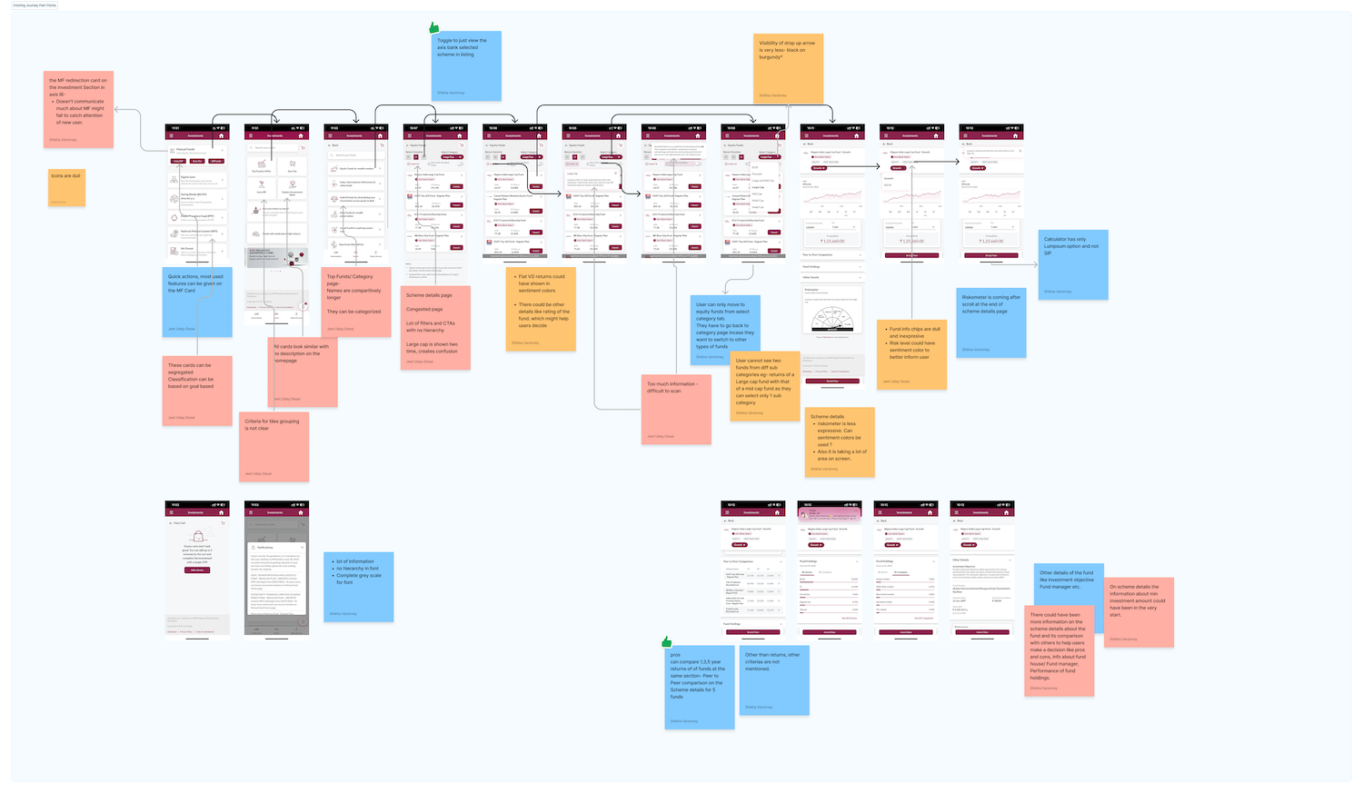
A UX audit of the live journey, a heuristic evaluation across four dimensions (communication of information, visual elements, features and avenues, and navigation) that tagged every point of friction and its likely cause.
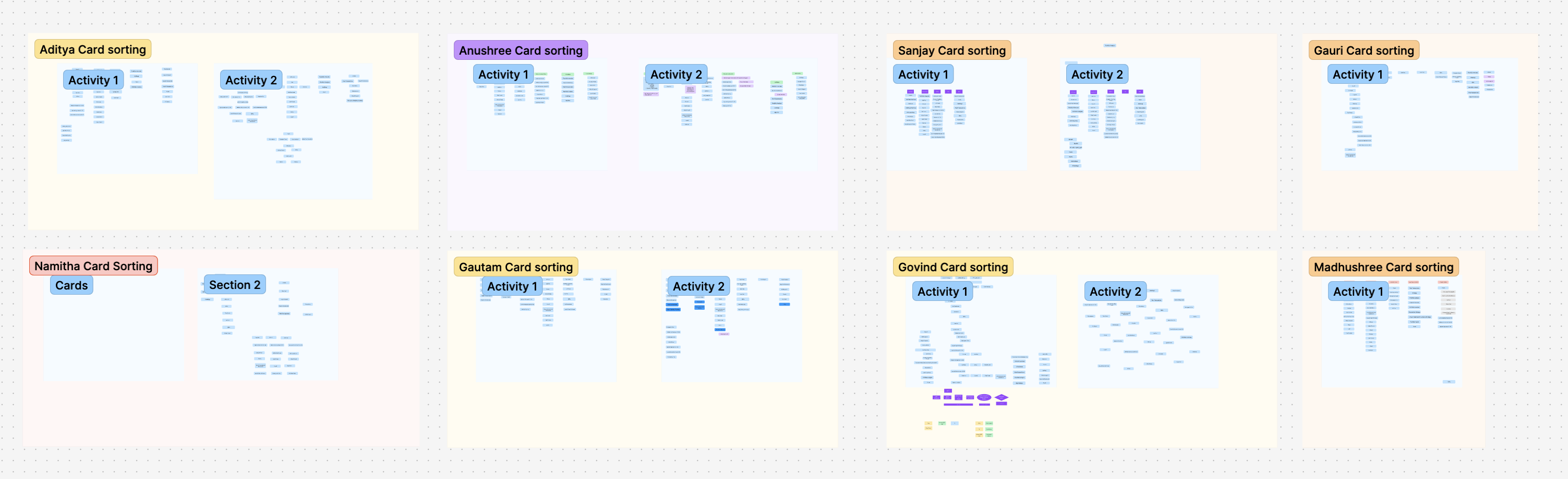
Card sorting with stakeholders, to rebuild the information architecture around how people actually group funds.
.png)
Benchmarking what leading investment apps surface on their home screen, to decide what earned a place on ours.
Most people weren't struggling to invest. They were struggling to decide.
Underneath the drop-offs were two very different people using the same journey.
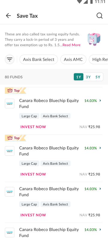
Knew where to invest
Already had a scheme or category in mind, Large Cap, ELSS, Gold. They wanted speed and a direct path.
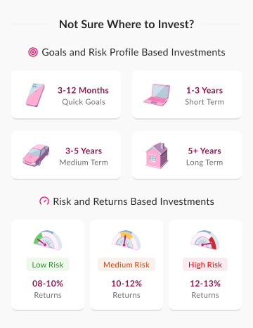
Wanted to explore and find
Knew they wanted to invest, but not where or how. They needed goals, risk, and comparison to feel sure.
Strategy
First-timers and experienced investors couldn't clearly identify their own paths. The redesign recognised the two types and gave each their own way in.
Different entry paths
A faster path for people who knew what they wanted, a guided one for people who didn't.
Confidence before commitment
Help people understand before asking them to invest, not just at the point of transaction.
Reduce confusion, not just steps
Where mandatory steps had to stay, simplify how they were shown.
Progressive disclosure
Ask for information only when it becomes relevant, instead of everything upfront.
Respect the constraints
FATCA, risk profiling, nominee, and KYC could not be removed, so design around them.
Rebuilding discovery
Discovery became the heart of the redesign. The home and listing stopped being a wall of schemes and became an entry point shaped around intent, with curated top picks, goal and risk based paths, and search always within reach.
Explore page
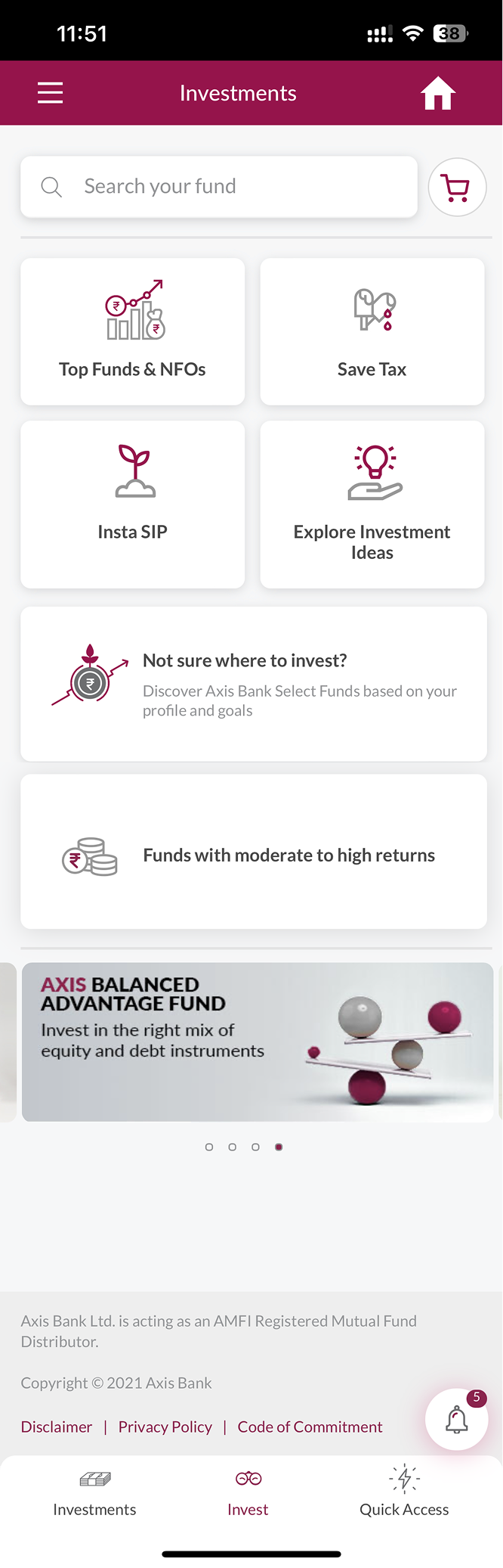

A flat grid of look-alike tiles becomes a home shaped around what each investor is trying to do.
Fund details page
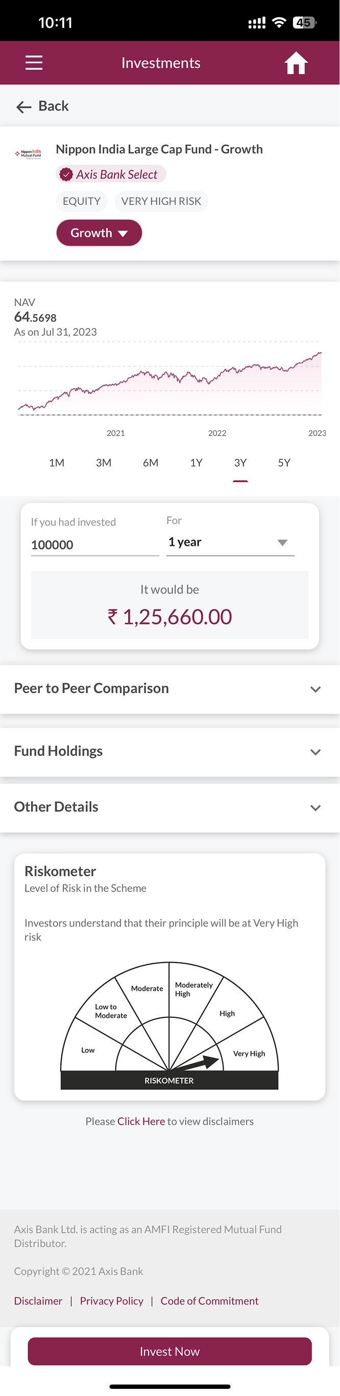

The numbers that matter and what they mean, in one scan instead of buried in accordions.
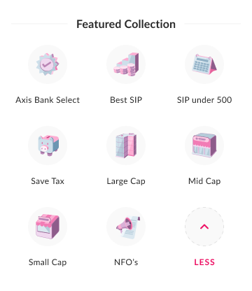
Curated collections
Featured collections give confident investors a quick route to their category.
See it grow first
A returns calculator, designed to show what a SIP could become before any form appears.

Jargon, explained in place
Plain-language explainers on categories and terms, right where the decision happens, so unfamiliar words don't stall it.
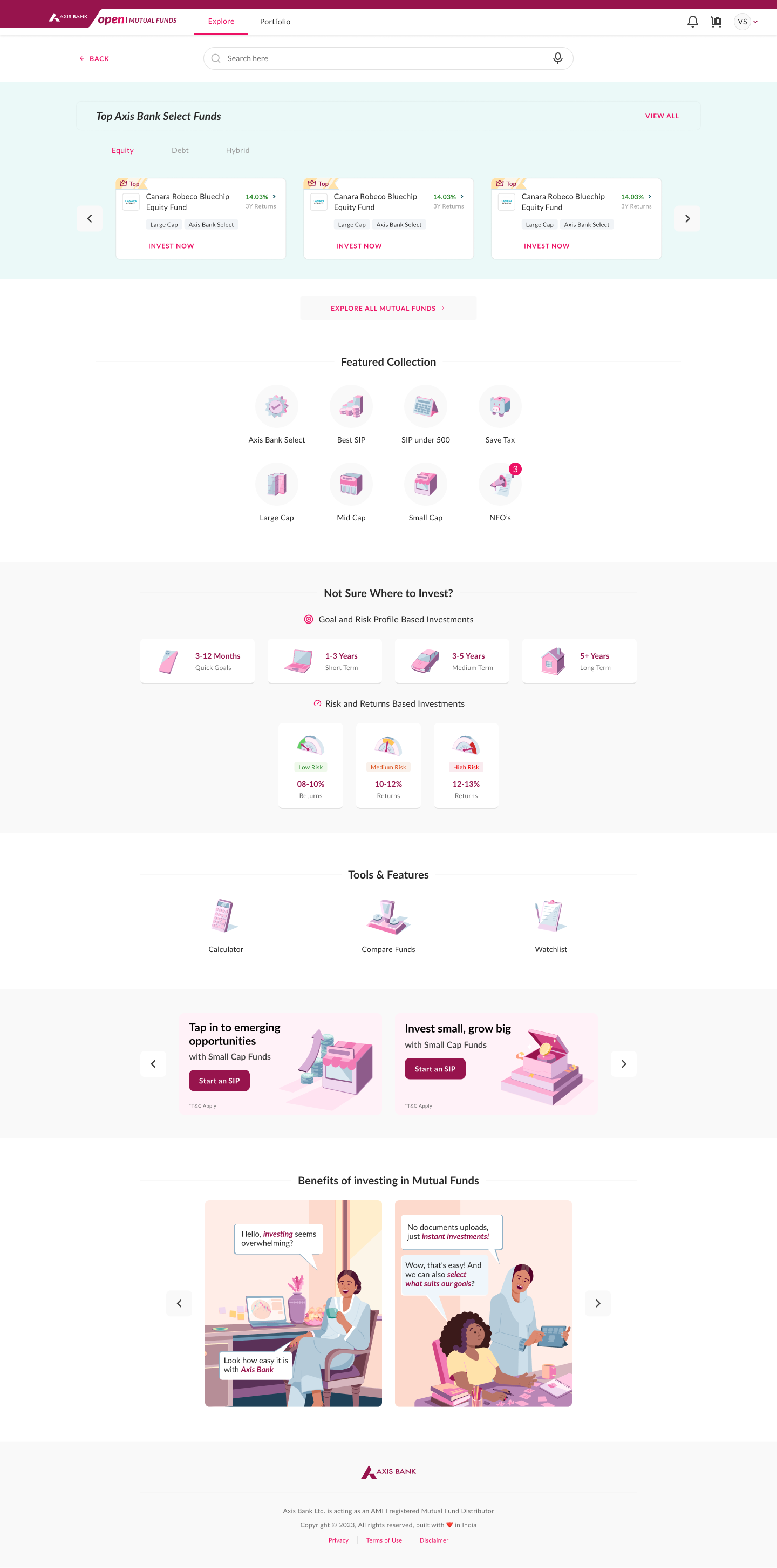
The same discovery system designed for web: top picks, goal and risk based entry points, and evaluation tools.
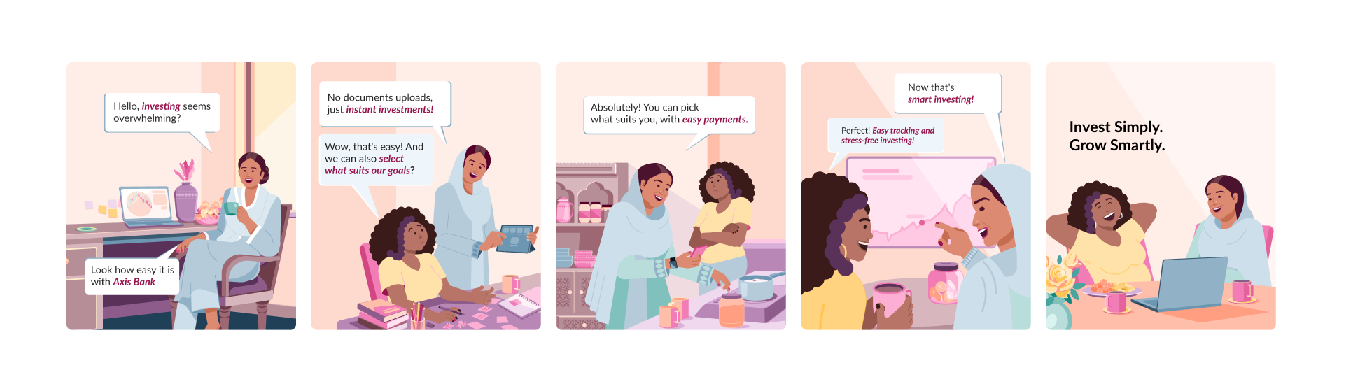
Also explored: the benefits of mutual funds told as a short comic story, for people who would rather follow a story than a table.
Registration and transaction
The mandatory steps were the ones people dreaded, and none could be removed. So the work was making them feel lighter: smaller logical steps, progressive disclosure, and moving nominee declaration out of the transaction form so the form itself stayed focused on the investment.
Order form
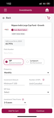
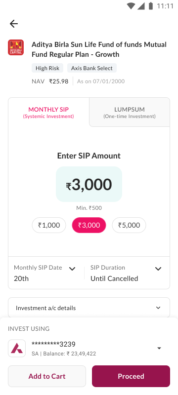
The same SIP or lumpsum choice, with the amount made obvious and everything else revealed only when it matters.
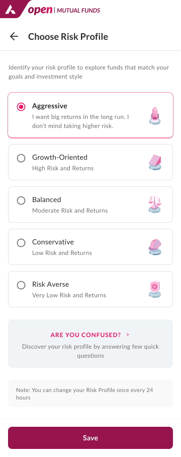
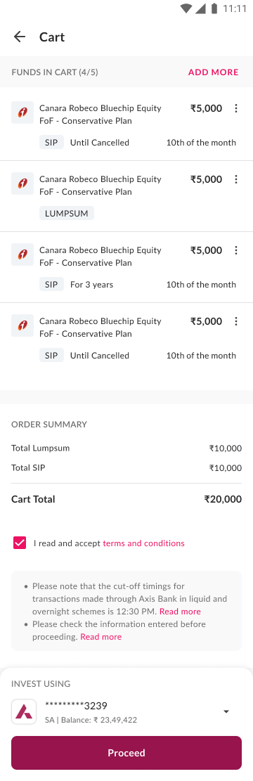
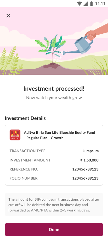
Risk profiling as a simple choice, a calm verification wait, a clear cart review, a confirmation that spells out what happens next, and, for someone yet to invest, a preview of what their portfolio will show.
Portfolio and beyond
The redesign carried through to everything after the first order, so the experience stayed consistent across the whole lifecycle. After launch, the focus shifted from getting people to invest once to helping them invest consistently, through SIP adoption and reducing SIP stoppage.
Portfolio
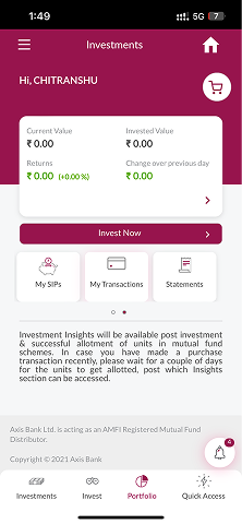
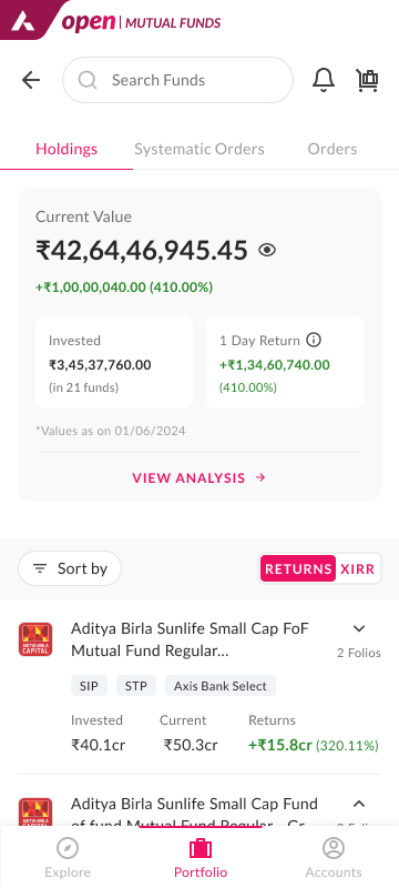
From a placeholder that felt empty to a dashboard that shows what you own and how it is doing.
Beyond the dashboard, a dedicated analysis view helps people see not just what they hold but how it is spread: where their money sits across categories, and how their investing has trended over time.
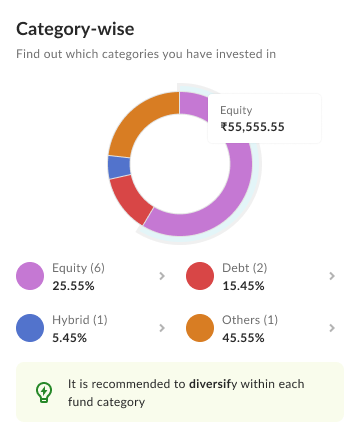
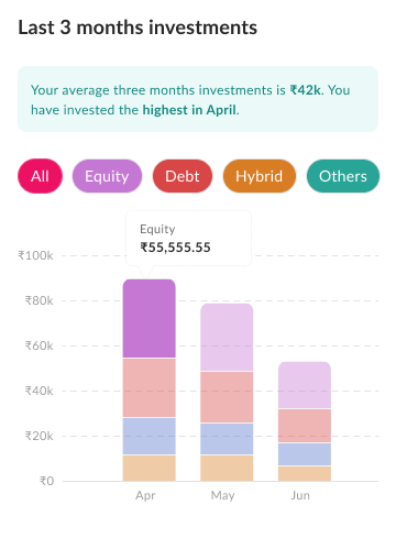
Two of the analysis views: category-wise distribution and recent investment trends. Designed, built, and partially shipped.
What we designed but held back
Not everything shipped. A few evaluation features were designed and then held for later, so the release could focus on the journey people actually walked every day.
Compare Funds, a Watchlist, and social proofing were designed but held back by backend dependencies, engineering effort, and regulatory limits. They stayed on the roadmap as future opportunities, not unfinished work.
Outcome
~10%
more people register and invest after the redesign
Lakhs*
active investors on the platform every month
Thousands*
of crores in transaction volume a year
The registration lift is the shift attributable to this redesign. *The scale figures are indicative: the exact numbers are confidential and can't be shared publicly.
Registrations and investment volume also grew after launch. The redesign became the foundation for the SIP-specific improvements that followed, increasing SIP adoption and reducing SIP stoppage.
We made the Mutual Funds launch film for this redesign in-house. Watch it ↗ to see the journey in motion.
People go ahead when they feel sure about the decision, not just because there are fewer steps.
Reflection
Plenty was broken in the old experience, across the flows, the UI, the information architecture, and the technical layer underneath. Fixing those mattered. But the deeper problem was that it treated every investor as the same person. Naming the two mental models, and letting each find their own way in, did more for the product than any single screen fix.
It also taught me that designing the screens is only part of the job. What mattered just as much:
If I were redesigning this today:
- Ship the evaluation tools, Compare Funds and calculators, that people kept reaching for.
- Stronger SIP nudges and post-investment engagement, not just a dashboard to visit.
- Real analytics from day one, so behaviour could be measured instead of inferred.