Lending · Axis Bank
Midas — A Digital Gold Loan Journey
Designing clarity and control into a traditionally opaque gold loan, simple enough to trust the first time.
Took a branch-led gold loan onto the phone. Customers now arrive prepared, and officers open a pre-filled application instead of a blank form.
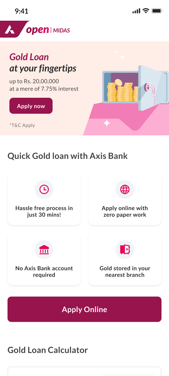
Role
Product Designer, end-to-end UX from wireframes to dev handoff
Platform
Customer app on mobile, officer tool on web
Team
Collaborated with a senior designer on visual design
Context
Gold loans in India have traditionally been a branch-led process. Customers visit a branch, speak with a Gold Loan Officer, understand the available schemes, get their gold valued, and complete the rest through existing operational systems. It works at a relationship level, but it creates uncertainty, long waiting times, and heavy dependency on branch operations. At the time, only a few specialised players, Rupeek and Muthoot Finance among them, had introduced digital application journeys. For a large, traditional bank, this was still a relatively new and cautious space.
How much can I get? How long will it take? What will it cost in interest and fees? For a first-time customer, none of these had an answer until they were already at the branch.
From a customer's perspective, the process felt:
Officer-dependent
Everything ran through branch conversations and officer availability.
Unpredictable
No clear sense of time, steps, or outcomes before walking in.
Opaque
Offers, eligibility, and documentation stayed invisible until the visit.
Stressful
Long waits, repeated explanations, and your gold changing hands.
Which raised a sharper question: how much of this actually needed a branch?
every step depends on officer availability and branch hours
the customer walks in knowing almost nothing about offers, eligibility, or documents
The old process: relationship-led and trusted, but opaque and unpredictable for a first-time customer.
The old branch process worked, but it leaned entirely on the branch officer, not on anything a customer could check for themselves.
Approach
I joined after research insights and a proof of concept were already approved by leadership, the need for a digital gold loan journey was established before I came in. My part was translating that into an actual product:
Working closely with Product, Business, and Engineering along the way.
The wireframes went to a senior designer who led visual design. I reviewed the visuals to keep the UX intent intact, and reviewed again once development was complete, so what shipped matched what was designed. Once the first round of customer and officer journeys was handed to development and audited, the project moved to another designer for enhancements as I moved on to my next project.
The goal wasn't just to move it online, it was to make the journey clearer and more in the customer's hands, while keeping the branch workflow intact.
None of this happened in a vacuum. The work sat inside real constraints: compliance-heavy forms, a legacy system on the branch side, an existing operational workflow that could not be disrupted, and the technology limits of a large, regulated bank.
Design Decisions
The journey was shaped around four ideas. Everything that follows is one of them, in practice.
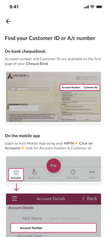
Help, where people got stuck
Finding your customer ID stalled real applications, so help sits inline, with a passbook reference, right where the question arises.
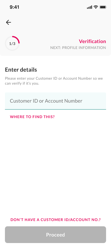
Progressive disclosure
Long, compliance-heavy forms were broken into smaller steps, while keeping customers aware of overall progress.
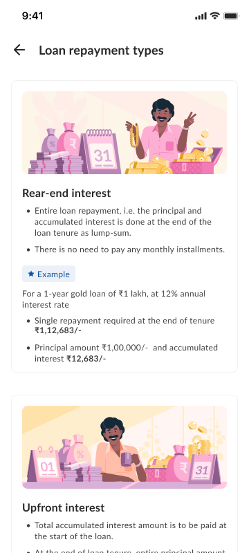
Explain, don't persuade
Explains repayment types and interest models in plain language, so customers decide instead of relying only on verbal explanations.
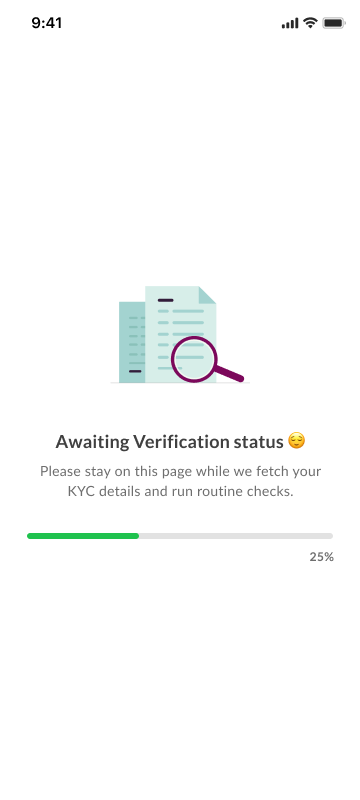
System status and feedback
Keeps customers informed during verification, replacing silence with clear system feedback.
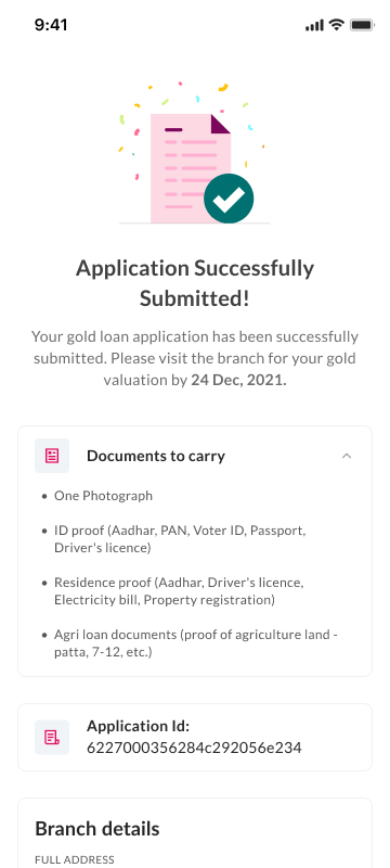
Know what to carry
Clearly lists documents and next steps before the branch visit, so customers walk in prepared rather than surprised.
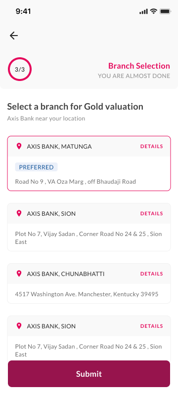
Appointment scheduling
Not just a convenience feature, it aligned customer arrival with branch readiness so the officer, valuer, and documentation could be better coordinated.
A Closer Look
An answer before an application
Most customers' first question is simply "how much can I get for my gold?". The calculator answers it before any form appears, which set the tone for the whole journey: information first, commitment later.
Repayment, explained before it's chosen
Interest models are where gold loans quietly get expensive. Worked examples in plain language meant customers chose a repayment type they understood, instead of the one they were talked into.
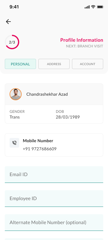
Personal details, only when they mattered
This step only came up after customers already understood the offer they were applying against, so it read as the next logical step, not an upfront form standing between them and their loan.
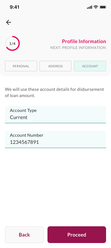
Linking a bank account, without the jolt
Account verification sat inside the same flow and tone as the rest of the application, instead of feeling like a separate, jarring banking task dropped into the middle of it.
The Whole Journey
One system, two halves. The customer's side runs in the app, up to the point where a gold loan legally and physically must happen in person. Knowing where the digital experience should stop was as much a design decision as any screen.
information entered digitally flows into the officer's tools, so nothing is asked twice
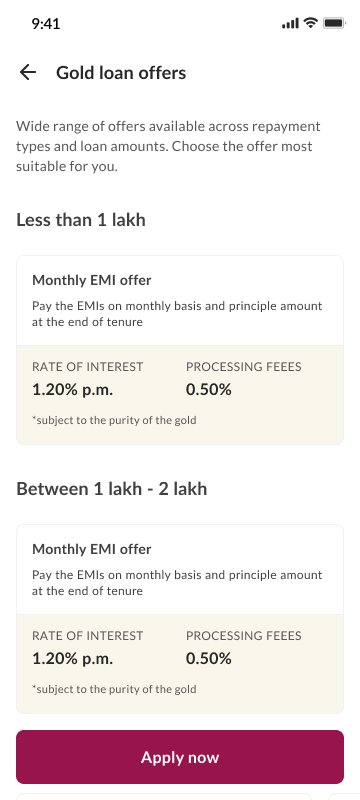
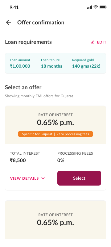
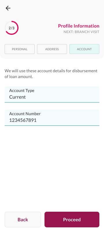
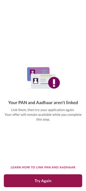
The customer's half in practice: offer discovery and confirmation, stepped verification, account validation, and edge cases handled with guidance instead of dead ends.
The Officer's Side
The journey didn't end at the branch door. Applications submitted digitally still needed to be valued, verified, documented, and disbursed, so the officer's internal tool was reworked alongside the customer journey, redesigned from a legacy system without disrupting the operational workflow branches depended on. Clarity for the customer couldn't come at the cost of more work for the officer.
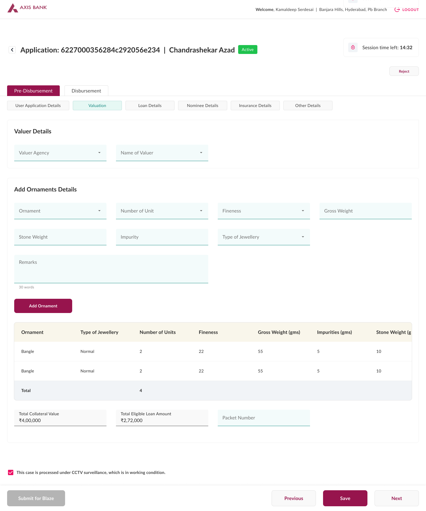
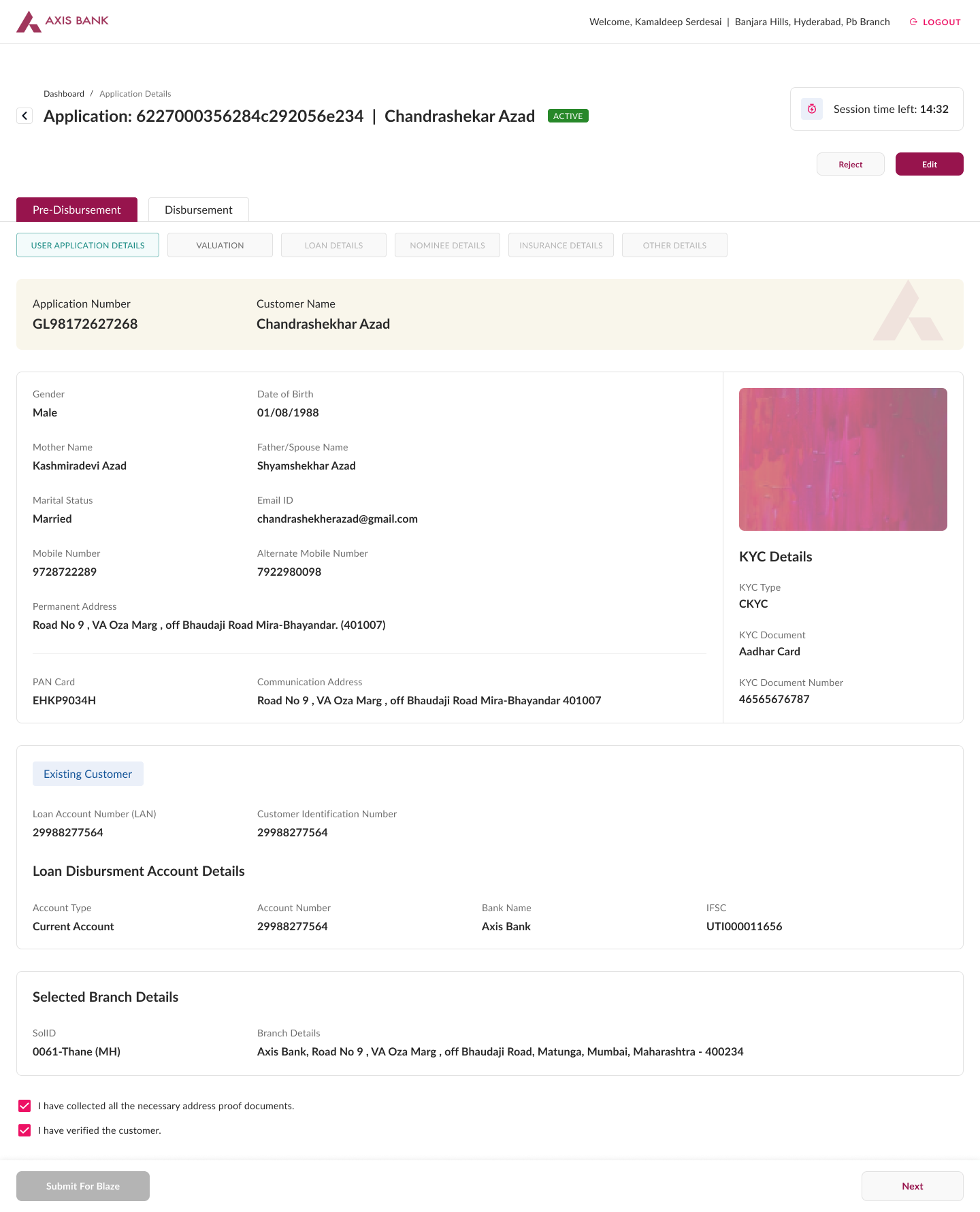
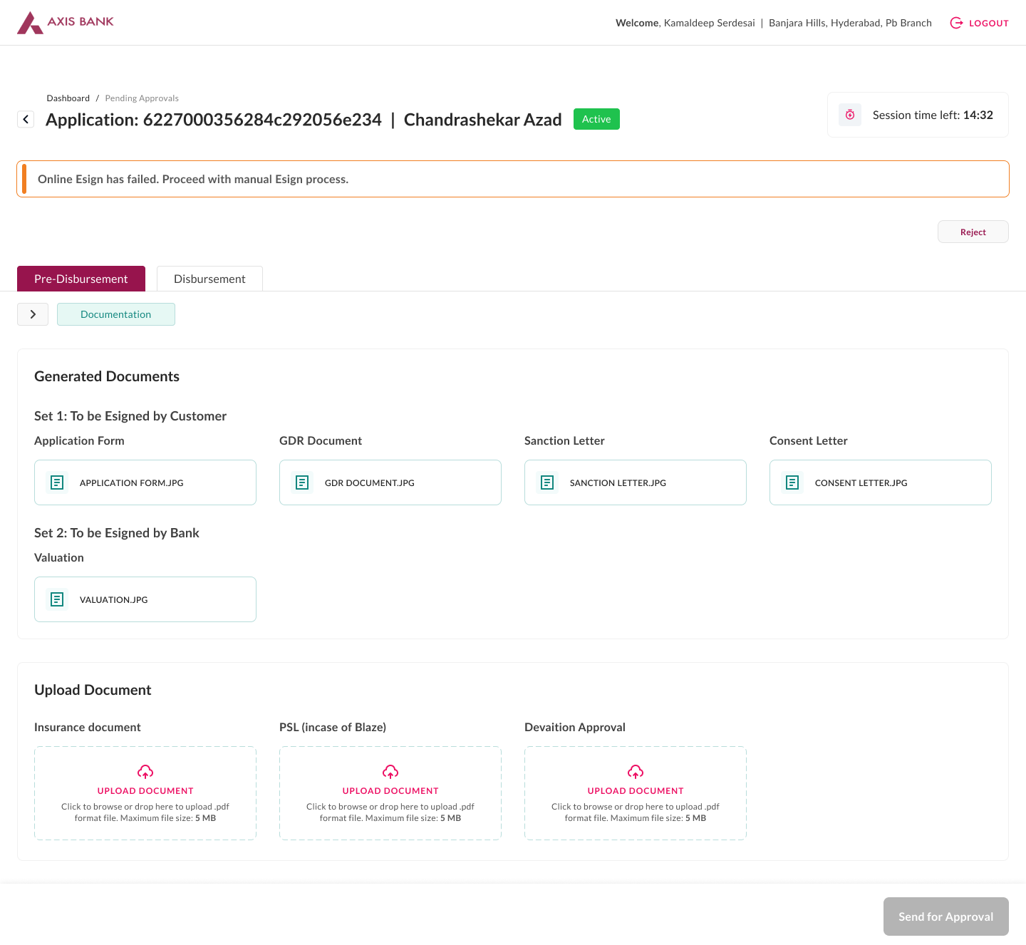
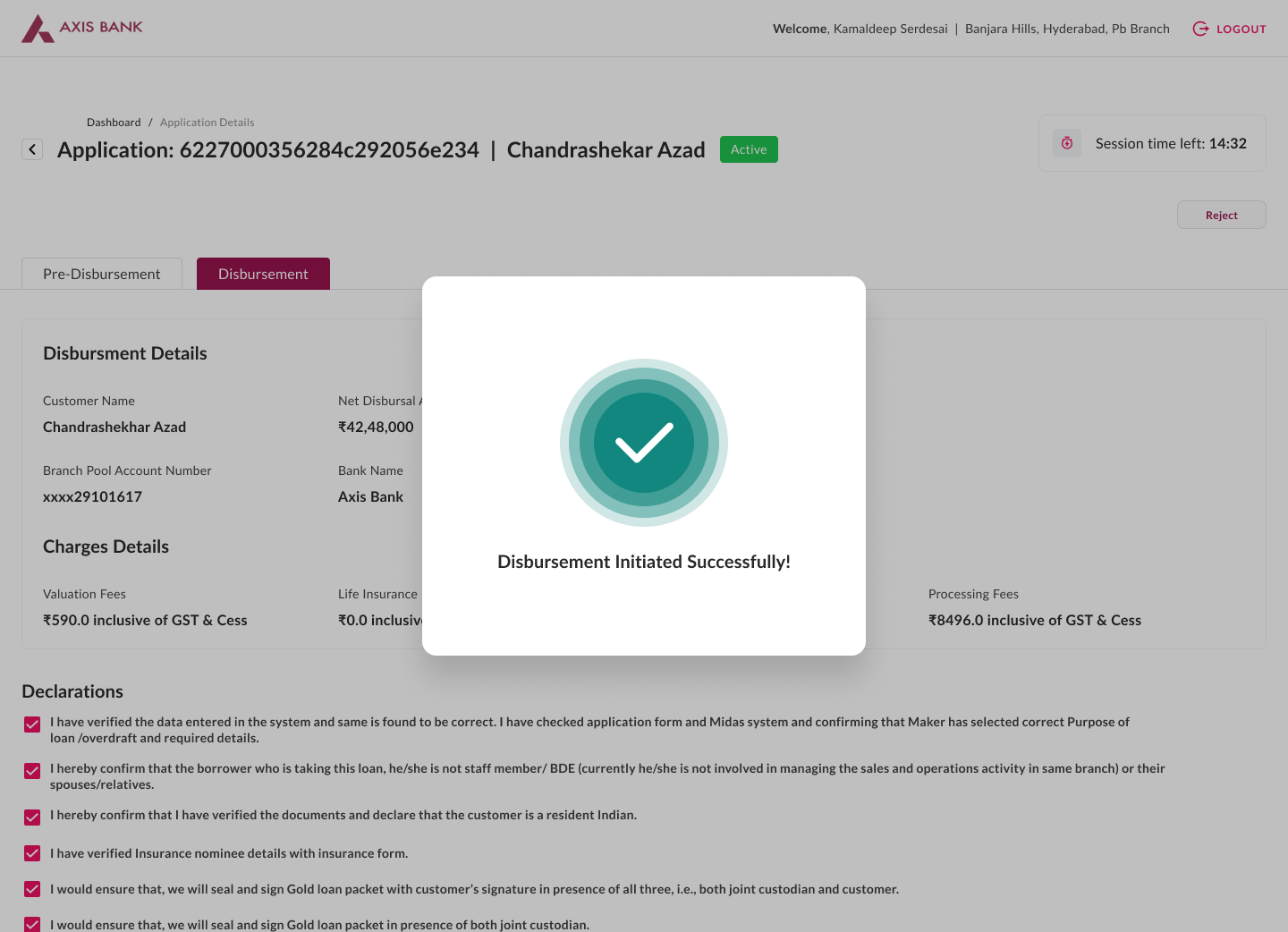
Four screens from the internal web tool: valuation, application details pre-filled from the customer's digital application, validations, and disbursement.
Outcome
Thousands of crores*
in gold loans move through the journey I designed
*Indicative scale. The exact figures are confidential and can't be shared publicly.
Beyond the numbers, what the redesign changed is concrete in how the journey is built to work:
Prepared before the branch
Offers, requirements, and next steps are laid out on the phone, so a customer can walk in already knowing what to expect.
Offers in the open
Customers can compare schemes and offers themselves, instead of relying only on what an officer chooses to explain.
A more focused branch visit
Appointments set expectations around timing, walk-in customers can keep going digitally inside the branch, and officers open a pre-filled application instead of a blank form.
Less duplicate work for officers
Information a customer enters flows into the internal application, so the same details aren't re-keyed at the branch.
Design here wasn't about replacing the branch. It was about removing the uncertainty, so people felt ready before they got there.
Reflection
Looking back, I don't think the most interesting part of this project was the application. It was learning where digital experiences should intentionally stop. The real work was designing the transition between digital and physical service, and respecting how trust-based processes already function on the ground, not replacing them.
If I were redesigning this today, three things would change:
- The landing page would work harder at setting expectations from the very first screen
- Offer discovery would reduce comparison to the trade-offs that matter most, using today's patterns for scanning schemes at a glance
- Form filling would get lighter still, using what's technically possible now without compromising compliance