Investing · Axis Securities
Galaxy — Rebuilding Axis Direct
A ground-up rebuild of Axis Securities' investing platform for traders and investors, across mobile and web. I owned the transaction experience, where one tap places a real trade and the interface has no room to get in the way.
5L+ downloads and ~4.5★* on the Play Store, live as the Axis Direct Investor App since 2024.
Role
Product Designer, owned Transactions among other modules
Platform
Mobile and web (Axis Direct)
Team
Around 6 to 7 designers across pods, with product, business, research, and engineering
Context
The existing Axis Direct platform was carrying a lot: legacy technology, a dated experience, several disconnected systems, and scale limits, all against fast-moving competition and rising customer expectations. So this was set up as a full rebuild of the platform, not a redesign of a few screens.
The scope reflected that: a mobile app, a web platform, micro-frontends, middleware, a shared design system, research, information architecture, UX, UI, and QA. The mobile app was one part of something much larger.
Legacy technology
Years of accumulated systems that were hard to change or scale.
A dated experience
A UX that no longer matched what traders and investors expected.
Disconnected systems
Multiple products stitched together rather than one platform.
Rising competition
New-age brokers were resetting what people expected, fast.
The task wasn't to patch the old platform. It was to make something this large feel like one product.
Research and domain learning
I joined Galaxy before any UI existed, and with almost no investing background; I had never actively traded. So the first job wasn't design, it was learning the domain: trading, order execution, holdings, positions, margins, and the language traders actually use. Business stakeholders explained it patiently, often the same question more than once, until it made sense.
If a designer doesn't understand the product and how people actually use it, they only build a UI, not a product.
Research was collaborative. Alongside the research team, we ran stakeholder and user interviews, competitor benchmarking, card sorting, and information architecture. Some of the strongest work happened in Mumbai: whole weeks with product, business, and experienced traders, watching how they actually work during market hours.
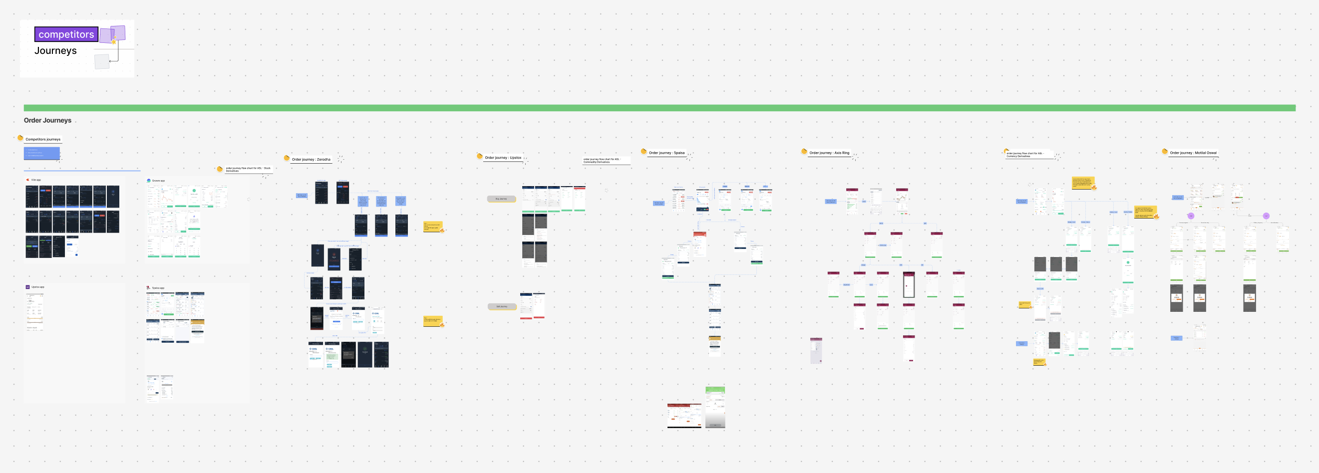
Mapping order journeys across competing broker apps, to understand the mental models before designing our own.
the same process ran across every pod, repeated for each module
In a product where markets move every second, users shouldn't spend time understanding the interface. They should spend it deciding.
The transaction experience
Transactions was the module I owned, and the most important one on the platform. Everywhere else, people look and read; here, they act. A mistake placing an order affects real money, user confidence, and trading volume, so it needed deep UX, not just visual polish. The constant tension: speed, without losing clarity.
The order form
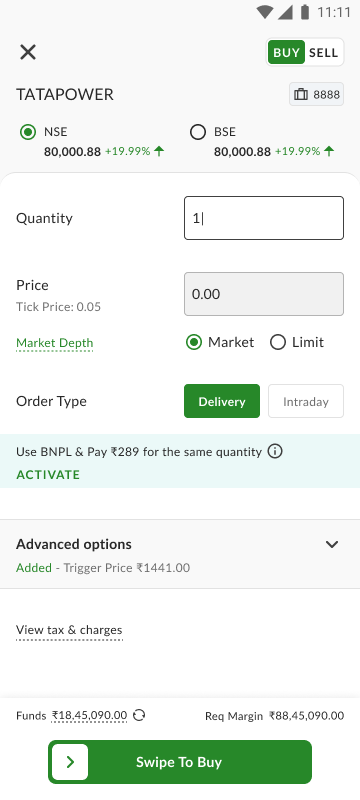
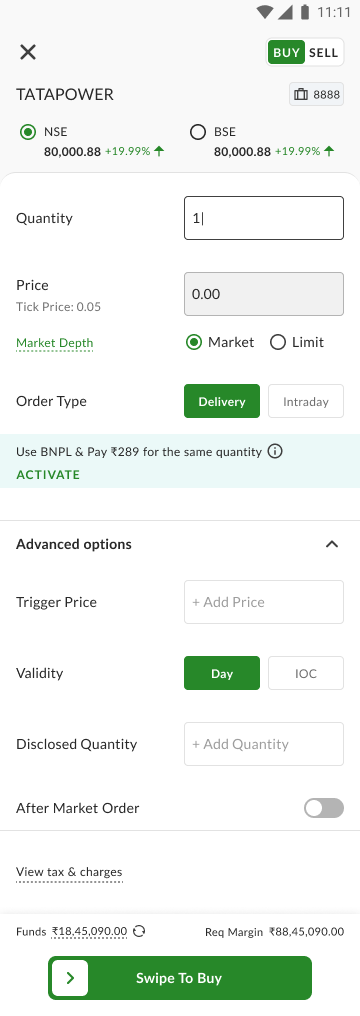
Progressive disclosure: the essentials stay clean for a fast order, while advanced controls (trigger price, validity, disclosed quantity, after-market) fold away and summarise themselves once set.
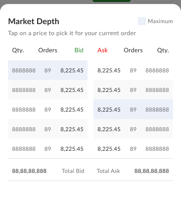
The depth, one tap away
Tap a bid or ask price in the market-depth ladder to drop it straight into the order.
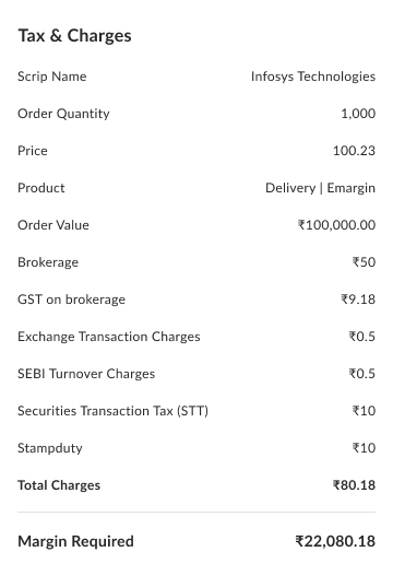
Every charge, before you commit
Brokerage, taxes, and the exact margin required, shown in full before the trade is placed.
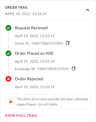
Rejections in plain language
When an order fails, the trail says why in words, like a price outside the day's circuit limits, not a cryptic code.
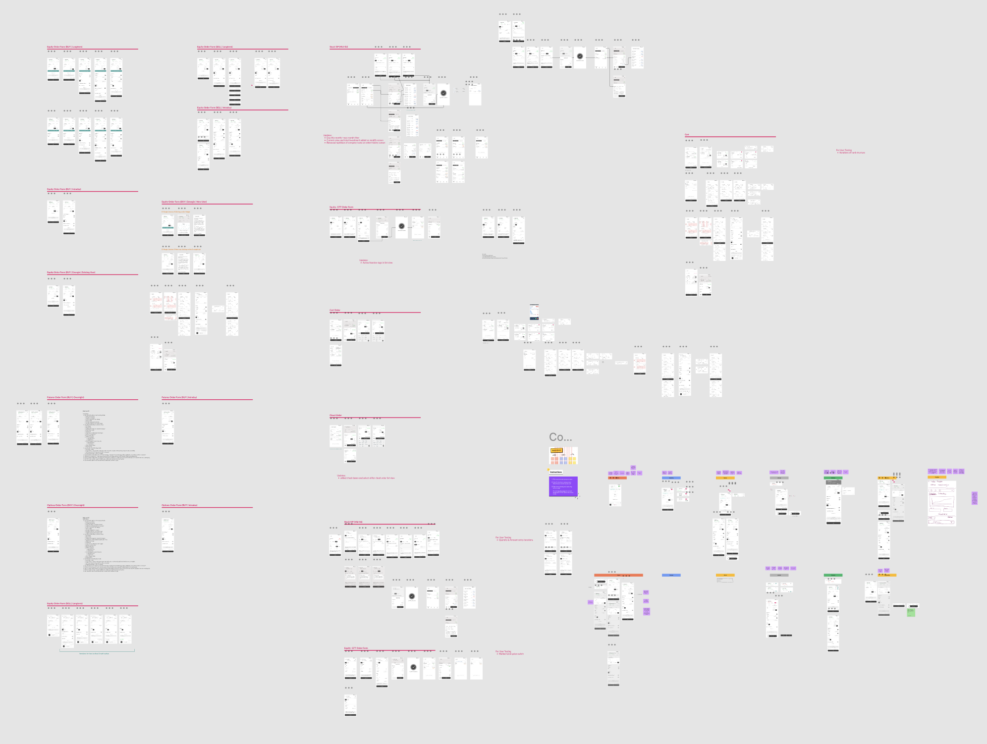
The order form went through dozens of iterations and rounds of user testing, across equity, futures, options, GTT, intraday, and margin.
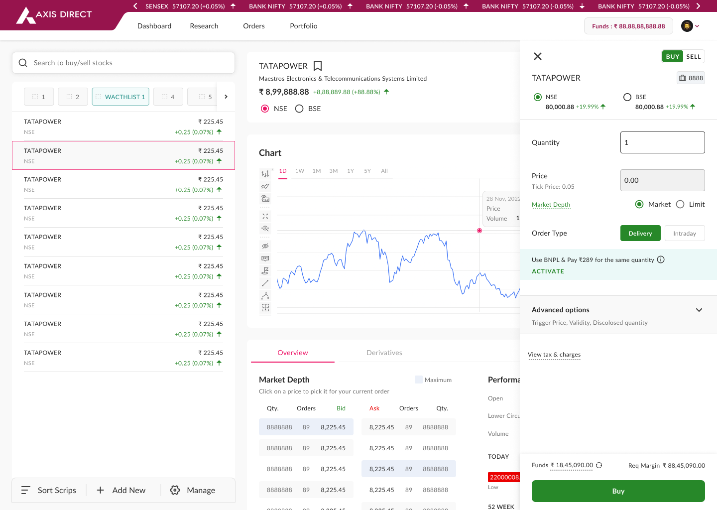
The same order flow on the web platform, so the experience holds across mobile and desktop.
Across the platform
Beyond transactions, I owned much of the platform, on both mobile and web:
Plus the states that quietly hold a trading app together: loading, empty, error, edge cases, and compliance messages. Consistency came from the shared SubZero design system.
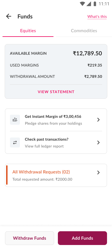
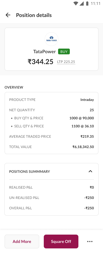
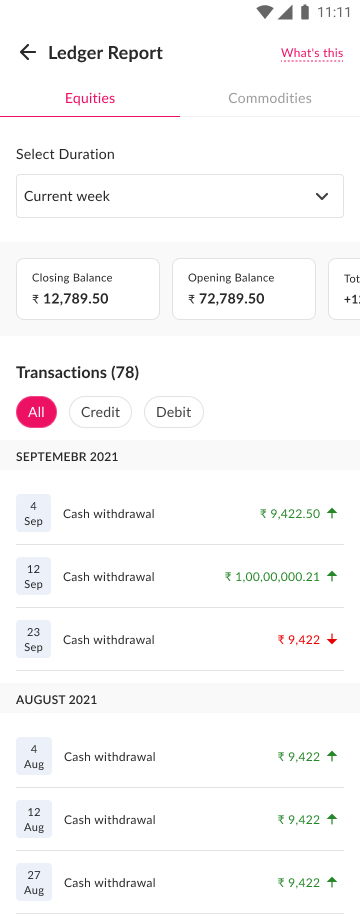
A few of them: funds and margin, then funds going on hold in motion, a position's details, the ledger, and pull to refresh in motion. The clips play on their own.
Holdings on the web platform, including the authorisation step required before you can sell.
Outcome
Galaxy launched in 2024 as the Axis Direct Investor App, and was received well by stakeholders, business teams, and financial consultants during project reviews and at launch.
5L+
downloads on the Play Store
~4.5★*
Play Store rating, mid-2026
2024
public launch, after multiple phases
*Downloads and rating shown are from mid-2026, when this portfolio was made, and grow over time.
The product is live and public: Axis Direct promotes the app, with journey walkthroughs of ordering, watchlists, and Equity SIP, on its official page ↗, and Axis Direct's release film ↗
Soon after launch, a change in banking rules moved the project out of Freecharge's hands. I stayed on for QA and design validation up to that point.
The most valuable thing I took from this project wasn't a design or a journey. It was really understanding how traders actually work.
Reflection
Galaxy changed how I approach large products. The scale only worked because it was split into focused pods, because collaboration mattered more than individual ownership, and because product, business, technology, and design stayed aligned throughout. No silos.
It also reinforced something from my earlier work at IDC and with NGOs: understand the domain, and observe people in their real environment, before designing. Ethnographic thinking applies just as much to a trading screen as to a village workshop. Even now, Galaxy is one of the most influential projects of my career.